Display Formats
Messaging Flex XL
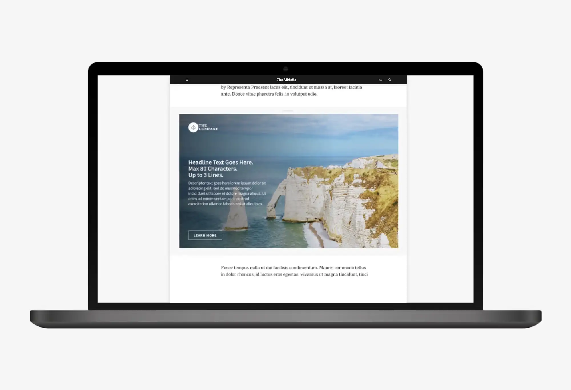
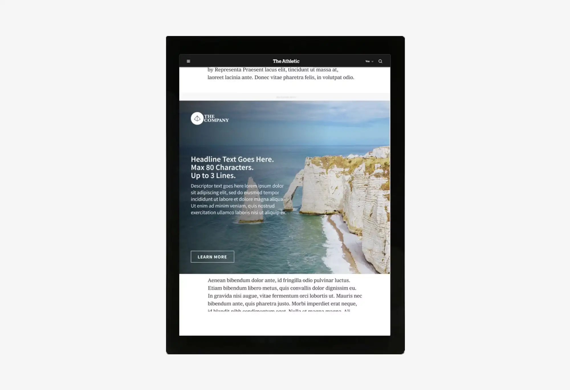
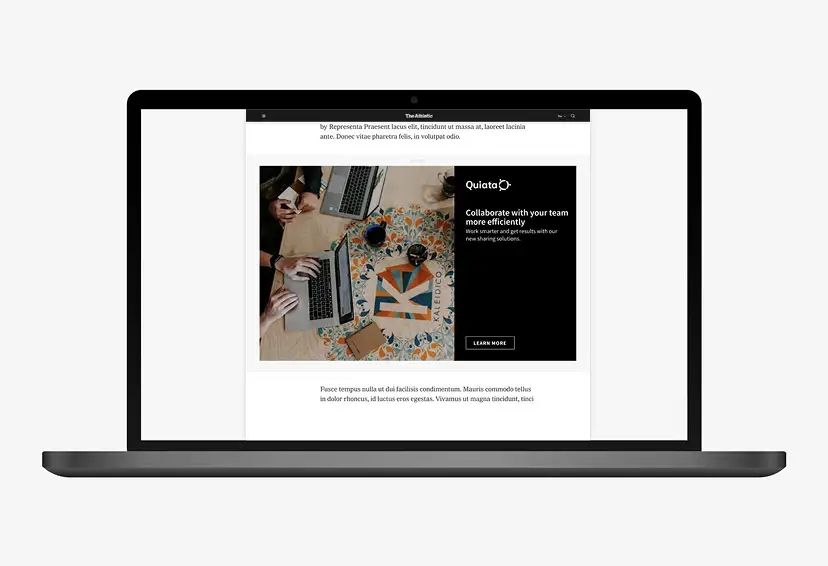
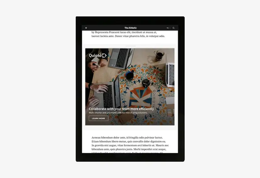
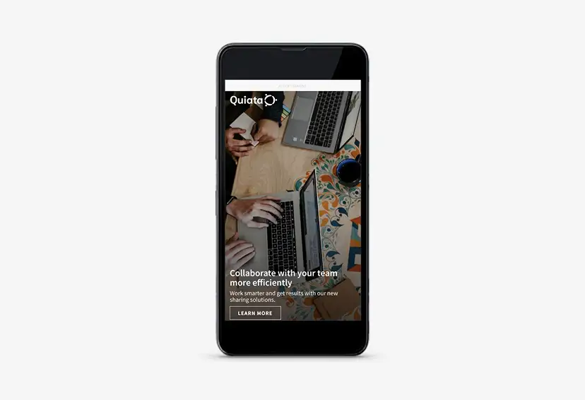
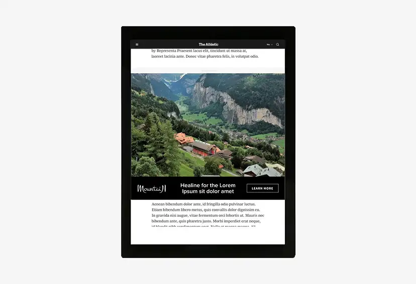
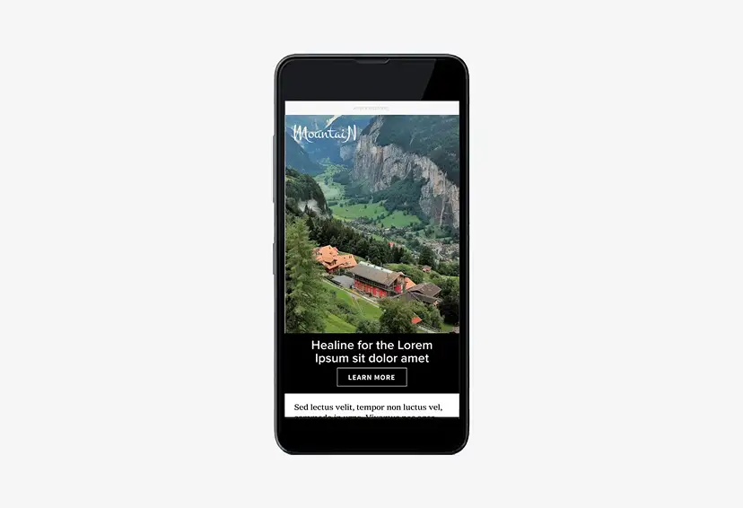
FULL BLEED
In our biggest canvas, the FlexXL, brands have more space to tell a compelling story led by an impactful still image that stretches across the entire ad unit, with a chosen headline, message and CTA.
Platforms:
Desktop, Tablet Web, Mobile Web, Mobile App
FULL BLEED SPECS
1 LOGO
File type: transparent PNG or EPS
1 HEADLINE
Character limit: 80
1 DESCRIPTOR MESSAGE
Desktop character limit: 140
Mobile character limit: 70
1 CTA MESSAGE
Character limit: 15
Click-through URL in HTTPS format
1 DESKTOP IMAGE
File type: JPG or PNG free of text, logo or branding
Dimensions: 1125x600px
Safe zone: 210px on left and right
1 MOBILE IMAGE
File type: JPG or PNG free of text, logo or branding
Dimensions: 800x1400px (Retina Display)
Safe zone: 100px on all sides
For Games Interstitial placement, top and bottom safe zones are 330px
FULL BLEED BREAKPOINTS
DESKTOP
1125x600
DESKTOP
985x600
TABLET
705x600
MOBILE
320x50px
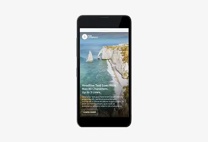
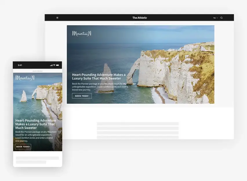
SPLIT SCREEN
In our biggest canvas, the FlexXL, brands have more space to tell a compelling story led by an impactful still image alongside a chosen headline, message and CTA.
Platforms:
Desktop, Tablet Web, Mobile Web, Mobile App
SPLIT SCREEN SPECS
1 LOGO
File type: transparent PNG or EPS
1 HEADLINE
Character limit: 80
Mobile character limit: 75
1 DESCRIPTOR MESSAGE
Desktop character limit: 210
Mobile character limit: 70
1 CTA MESSAGE
Character limit: 15
Click-through URL in HTTPS format
1 DESKTOP IMAGE
File type: JPG or PNG free of text, logo or branding
Dimensions: 600x600px
1 MOBILE IMAGE
File type: JPG or PNG free of text, logo or branding
Dimensions: 800x1400px (Retina Display)
Safe zone: 100px on all sides
For Games Interstitial placement, top and bottom safe zones are 330px
SPLIT SCREEN BREAKPOINTS
DESKTOP
1125x600
DESKTOP
985x600
TABLET
705x600
MOBILE
320x50px
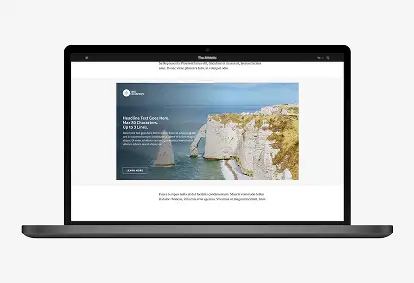
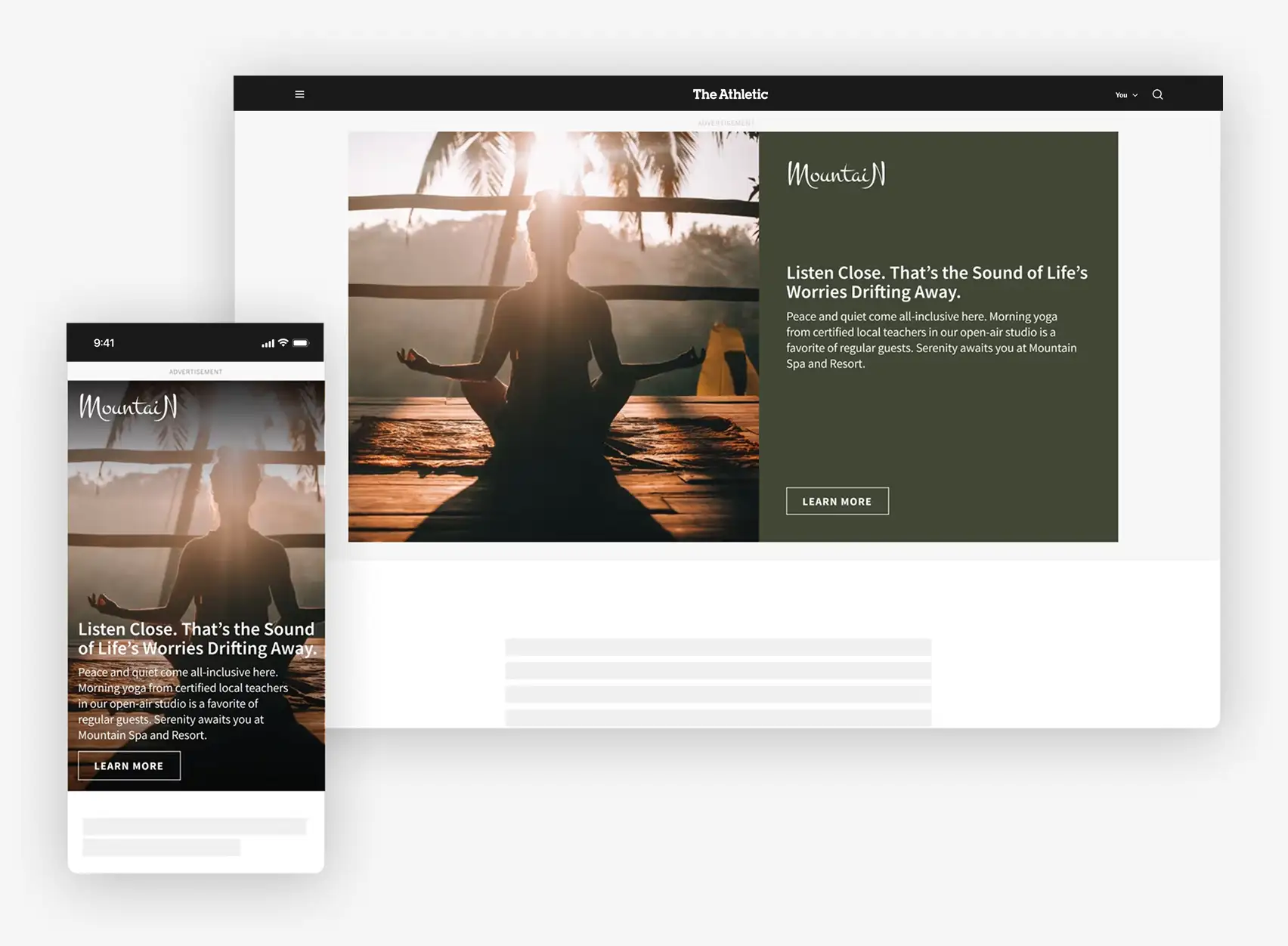
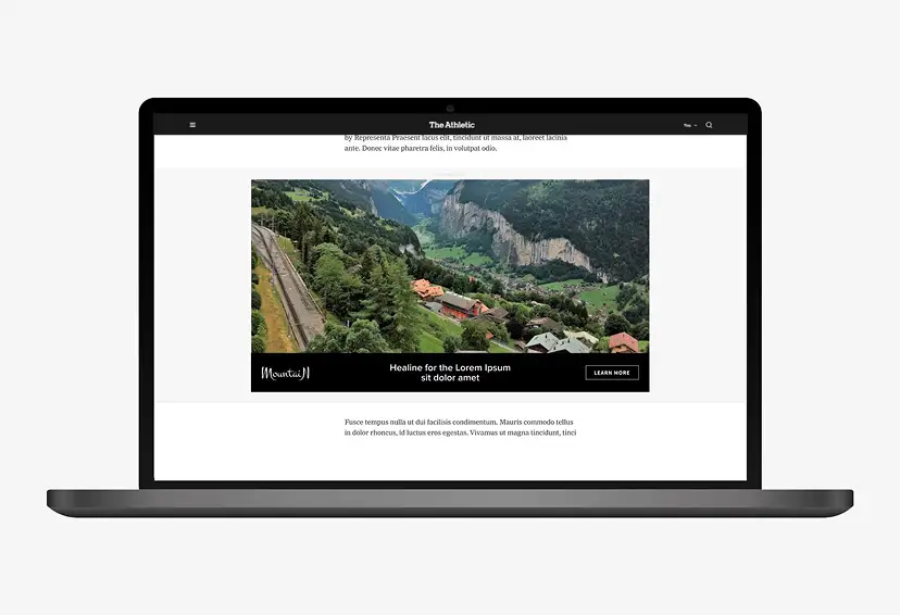
LETTERBOX
In our biggest canvas, the FlexXL, brands have more space to tell a compelling story led by an impactful still image that appears above a sleek and relevant brand message and CTA.
Platforms:
Desktop, Tablet Web, Mobile Web, Mobile App

LETTERBOX SPECS
1 LOGO
File type: transparent PNG or EPS
1 HEADLINE
1 CTA MESSAGE
Character limit: 15
Click-through URL in HTTPS format
1 DESKTOP IMAGE
File type: JPG or PNG free of text, logo or branding
Dimensions: 1125x490px
Safe zone: 210px on left and right
1 MOBILE IMAGE
File type: JPG or PNG free of text, logo or branding
Dimensions: 800x1400px (Retina Display)
Safe zone: 100px left, right, and top, 240px bottom
For Games Interstitial placement, top and bottom safe zones are 330px
LETTERBOX BREAKPOINTS
DESKTOP
1125x600
DESKTOP
985x600

TABLET
705x600
MOBILE
320x50px
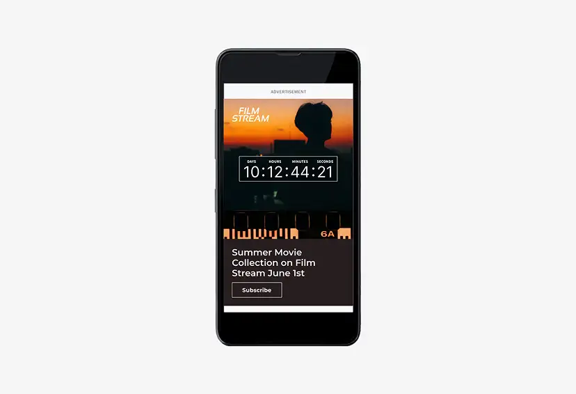
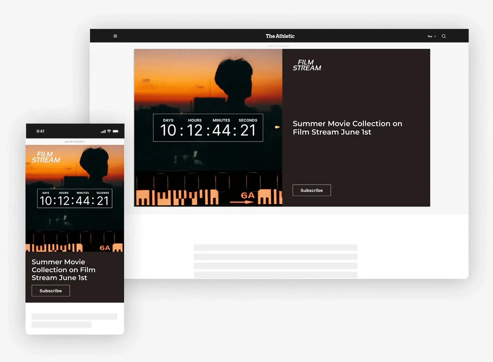
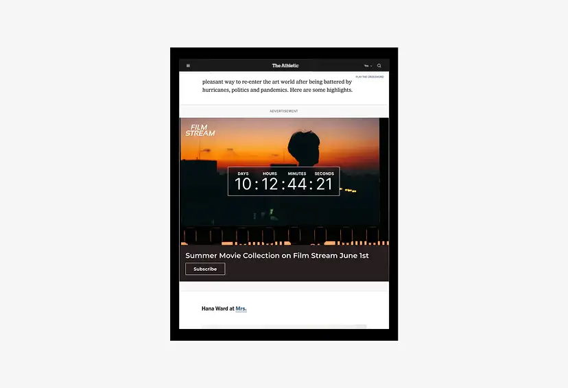
COUNTDOWN
The Countdown Messaging Flex XL is a highly customizable variation of the Messaging Flex XL that can be used to build excitement around a notable event.
Platforms:
Desktop, Tablet Web, Mobile Web, Mobile App
COUNTDOWN SPECS
UP TO 2 LOGO
File type: transparent PNG or EPS
1 HEADLINE
Character Limit: 80
1 DESCRIPTOR MESSAGE
Desktop character Limit: 210
1 CTA MESSAGE
Character Limit: 15
1 DISCLAIMER OR CAPTION (OPTIONAL)
Character Limit: 100
1 COUNTDOWN END MESSAGE (OPTIONAL)
Character Limit: 30
1 DESKTOP IMAGE
File type: JPG or PNG free of text, logo or branding
Dimensions: Right and Left Offset - 656 x 600px
Safe zone: 140px on left and right
1 TABLET IMAGE (OPTIONAL)
*Note: If a Tablet image is not provided, the desktop image is used at Tablet sizes.
File Type: JPG or PNG free of text, logo or branding
Dimensions: 1536 x 1200px
Safe Zone: 240px left and right, 250px top and bottom
1 MOBILE IMAGE
File type: JPG or PNG free of text, logo or branding
Dimensions: 856x1200px (Retina Display)
Safe zone: 100px left, right, top 440px bottom
For Games Interstitial placement, top and bottom safe zones are 330px
COUNTDOWN BREAKPOINTS
DESKTOP
1125x600

TABLET
705x600
MOBILE
320x50px